Wednesday, February 24, 2010

More donuts


Here are two more "donuts" that I have been working on this past week. Unfortunately, the picture of the yellow donut is not very clear, but it is done in the same style as the blue. It is tough to tell, but they are really a lot more fun in real life. I think that finishes up the stack of donuts I had on my workspace, so now I'll move onto something else.

Sweet Stop 44


As soon as I saw this sketch I knew how I wanted my card to look. And then I totally changed the execution of it. This is one of my favorite stamps from Inkadinkado. I stamped it onto four separate panels and since it doesn't fill up the fourth panel, it left the perfect place for the "Happy Mother's Day" stamp (from Sweet 'n Sassy). I punched out two flowers, trimmed off the points to make them look more like the stamped flower, layered them with a heart shaped brad and two hand cut leaves. The card is 5x5 with a 3/4 inch overlap on the bottom. The bottom flap tucks in under the panel on the front which is popped up on foam tape. I then dressed up the inside with my uppercrest punch by fiskars and another stamped flower from Inkadinkado. The sentiment, which says "May the simple joys of life fill this special day and be yours throughout the coming year." is from SU!


JUGS 21 color challenge


Oooohhh . . .the curses of modern technology! Being new to this blogging thing, I don't know a lot about how to compose a blog, hence the pictures that are out of sequence. Sorry. This is my card for the JUGS challenge this week. The challenge was to use raspberry, chocolate, coral and ivory. It is so tough to use four colors! Specially with two strong colors (raspberry and coral). But it did finally work for me. I made a 5x5 card with a 3/4 inch overlap at the bottom. The bottom flap tucks in under the chocolate layer on the front which is popped up on foam tape. I just had to dress up the inside, too.

Raspberry and melon cardstock are from PTI. The "Happy Mother's Day" stamp is from Sweet 'n Sassy. The inner sentiment is from SU! I hand drew the flowers on the front and the small flower inside.


Thursday, February 18, 2010

JUGS challenge #20


The challenge at JUGS this week was to use the split negative technique. My main image would not have been my first choice to use as I am not really a horse person, but it was the best image I had for this technique. I actually like the way it turned out. It has a western feel and is quite masculine. The horse and ribbon are from SU!, the sentiment is from PTI, and at this moment, I can't remember where the paper is from; hot off the press maybe.

Wire Wrapture


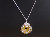
For those that have been wondering what my blog title has to do with card making, here you go. My real creative love is making jewelry, especially with sterling silver wire. I set up this blog to be able to post pictures of cards for contests, etc, but figured I might want to post pics of my jewelry creations, too, hence the name. Anyway, here are a few things I made this week. Gotta start now for all the summer festivals. It is only a coincidence that both focals are donuts. It was what was left on my workstation and I tried to come up with some fun ways to use them. Check back later for a couple more donuts that are even more fun.

Sweet Stop Challenge sss43


I tried, and tried, and tried, but I just could not make the top part of this card in an arc! It just looked terrible, so I took some creative liberties and liked the result much better. : ) Check out the Sweet Stop challenge to see those that could make it work! This card was made mostly with scraps and would have been very quick to make if it wasn't for the top. The stamps and ribbon are from SU! the rest is unknown; like I said, scraps.

Wednesday, February 10, 2010

JUGS 19 challenge


As soon as I saw the layout for the challenge, I knew exactly which stamp set I wanted to use--It's A Girl Thing by SU! The Celebrate stamp is from Damask Designs by PTI. I love that set. It's a little hard to tell, but the images are stamped on a pale gray. The largest circle is poped up on foam tape. I watercolored the images using the watercolor pens from SU! and various ink pads.

Sweet Stop challenge sss42


A round card is something I have never tried before, so it was a fun excursion off the beaten path. Thanks to the Sweet Stop for the nudge. The scalloped circle is attached to the back of the actual card. The bird stamp and the Imagine sentiment are both from Inkadinkadoo.

Monday, February 8, 2010

PTI "Paint by Number" Challenge


As my online user name begins with an "h" I had to use the above color palette in today's PTI challenge. These are NOT colors that I would use together normally (I guess that's why it is a "challenge"), but I actually do like the combo, in moderation.


The raspberry fizz and ripe avocado are from PTI. I did not have orange zest, so I used the orange from SU! (don't know the name off the top of my head). I also do not have terracotta tile, so had to use the closest I could find and have no idea where it came from. Damask designs came into play again (see my previous post(s)) with the focal image embossed with clear ink and the sentiment stamped in white. After seeing all the designers from PTI using buttons, I had to give it a try and had one that was very close to raspberyy fizz. All in all, the colors are very summery and brings hope that it will arrive soon. :)

Friday, February 5, 2010

Papertrey Ink-resist emboss challenge


After trying this challenge, I discovered that I really need to invest in some good quality embossing powder! The old stuff I have just doesn't cut it. I entered it anyway, and it doesn't look too bad. I followed Nicole's lead, using a text for my background and then stamped and embossed my favorite image from Damask Designs--perhapse the most gorgeous set I own and one of the very few I have from PTI. I had black and white cardstock out from a previous project and decided to throw in a little splash of red for some additional contrast. Unfortunately, you can't see the sentiment very well. It is also from Damask Designs: Happy Birthday to you, and I masked off the "to you" so it would fit in a nice strip along the bottom.
Wednesday, February 3, 2010

Sweet Stop challenge sss41


Since Valentine's Day is right around the corner, I chose to use the Sweet Stop challenge layout as for the cards I will send out this year. As you can see, this is not a traditional color scheme, but while I was looking for cardstock to use, I came across the black and white flower paper and imediately fell in love. I think it makes a gorgeous, elegant look. Enjoy!